brand identity, positioning
the background: The Boulder Phil is something that could only happen in a place like Boulder. The city’s relative smaller scale, general high degree of education and affluence, and spirit of adventure creates a community uniquely in dialog with the arts. It’s a place where a highly professional orchestra can be at home, pursuing ambitious projects and championing the transcendent experience of live music. The casual friendliness of the Boulder community is reflected in the ethos of the Phil, where it creates a camaraderie among the musicians that’s a distinct draw for strong talent.
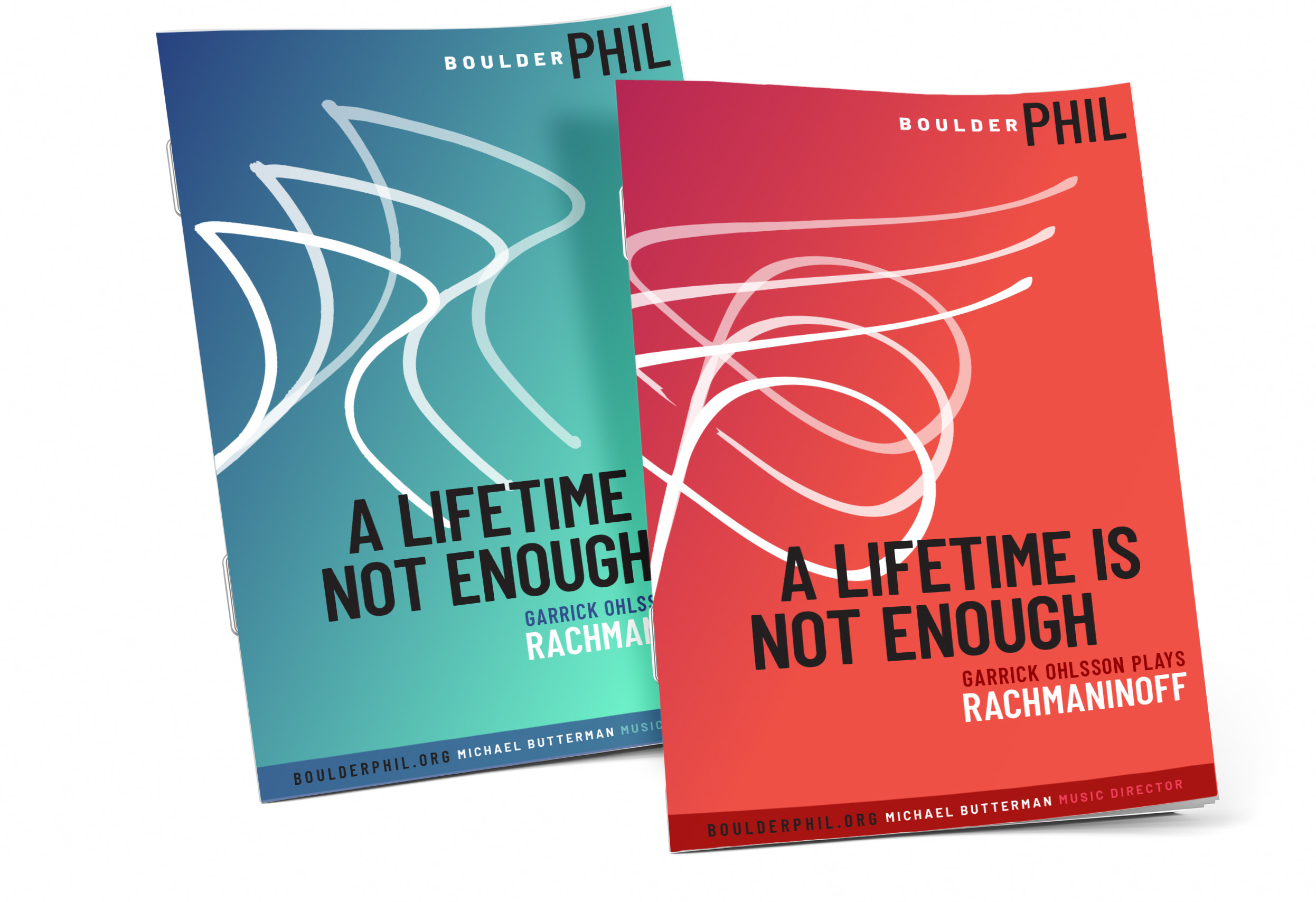
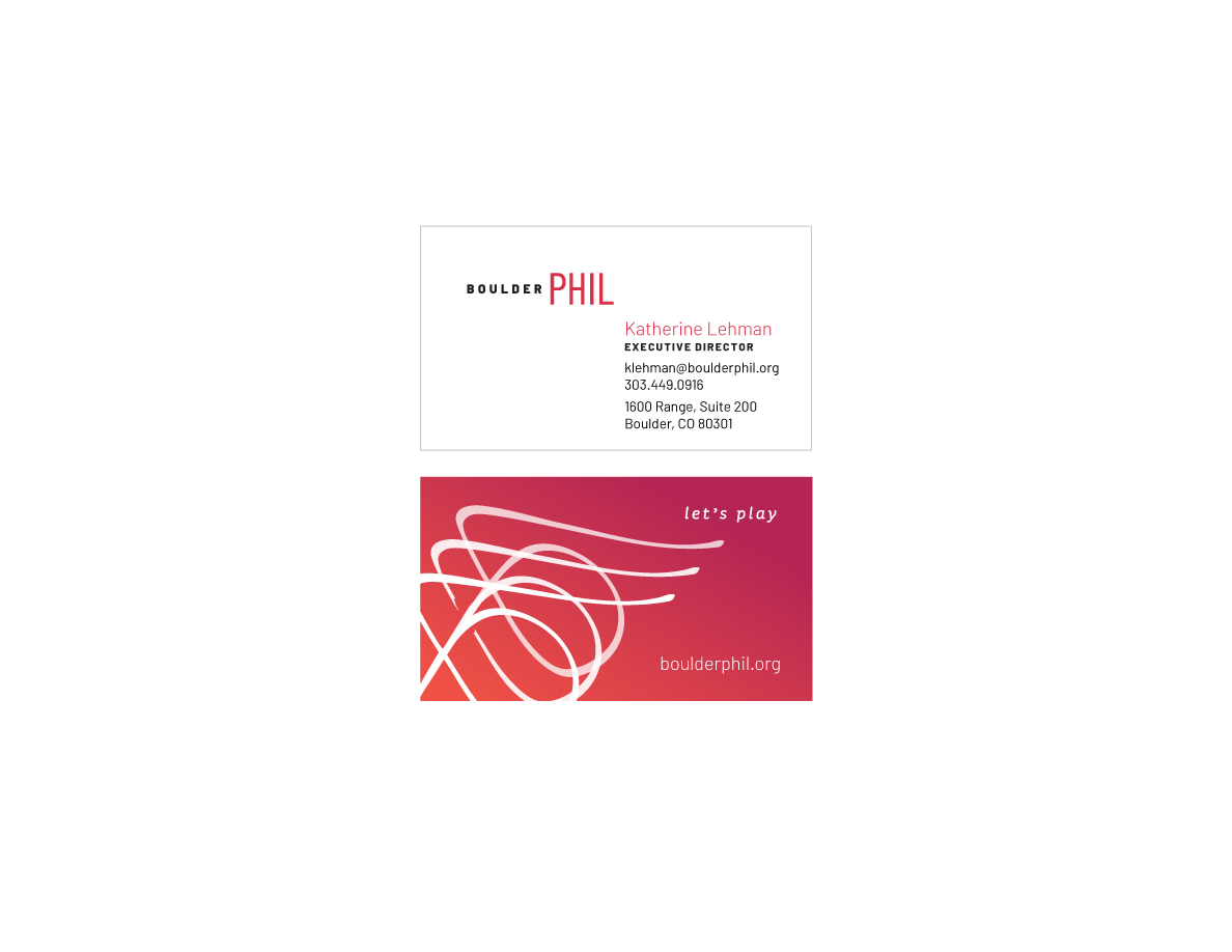
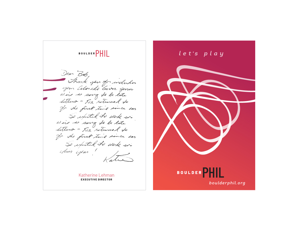
To energize and expand its audience, the Boulder Philharmonic Orchestra needed a new identity system that would stand out in an increasingly crowded cultural landscape, and more importantly, express the magic of a Boulder experience. The result is a shorter, more memorable name, three interchangeable, lyrical logos, a vibrant new color palette, and a catchy new theme: “Let’s Play.” The system is being deployed on program covers, ads, banners, email headers, and digital ads.
the ask: Evolve The Boulder Philharmonic’s identity and create a visual and verbal system that would evoke their high caliber, modernism, and forward momentum.
my role: tagline, identity development, positioning